empeg.css contest
Posted by: drakino
empeg.css contest - 28/06/2004 05:09
I'll just quote what I had on the down notice:
Know CSS? Care to lend a hand by cleaning up the empeg.css file?
Download this and edit the empeg.css file.
Page1.htm and Page2.htm contain example pages from the new board to test the file against.
All the new entries added by the new software start at blockquote and go to the end. Right now they are just set to the defaults.
If you do choose to change it, upload the final version here in this thread.
Posted by: Micman2b
Re: empeg.css contest - 28/06/2004 12:32
I will see what I can do to fix the CSS today... I will post this eve...
Posted by: Micman2b
Re: empeg.css contest - 28/06/2004 14:31
OK, here is what I have done and some comments... I am sure there are some things i am missing AND the Last Post link needs to loose the bold somehow... It looks better with no bold.
Anyhoo here are the changes and suggestions:
General Comments
Not a big deal but the following has implications whereas the first line of the thread list is the same color as the header line:
- The class called lighttable has a dark background
- The class called darktable has a light background
- The class called newlighttable has a dark background
- The class called newdarktable has a light background
Some of the Quick links and Addon links at the top are empeg specific. A little confusing when searching for a Karma dock or some other accessory for other Rio devices. Maybe make a general Quick Links then Specific Addon lists like empeg Addon: and Karma Addon: and Rio Receiver/Central Addon: MAYBE???
HTML suggestions
- Reduce cellpadding from 3 to 2 for all tables with class="tableborders". This will make the border around the main tables a little smaller...
<table class="tableborders" cellpadding="3" cellspacing="1" width="100%"> TO
<table class="tableborders" cellpadding="2" cellspacing="1" width="100%">
CSS changes
- Changed these classes to repair white backgrounds on new thread list.
.newlighttable {
background: #515174;
font-weight: bold;
}
.newdarktable {
background: #636380;
font-weight: bold;
}
- Added new CSS class .navigation that was specified for navigation table. Does nothing right now!!! But I changed color for navigation table by changing background color for class .tablesurround
.navigation {}
.tablesurround { background:#444466;}
- Changed class .newsubjecttable. This is for new subjects that used to be white.
.newsubjecttable {
background: #515174;
}
- Moved the following to a more appropriate location to 'clean up' the CSS document a little
.pollcolor {
background: #000000;
}
.modcolumn {
background: #000000;
color: #ffc000;
}
--------------------------end CSS--------------
Sean in NC
Posted by: ricin
Re: empeg.css contest - 28/06/2004 19:47
I like this... Although I might be the only one.

Posted by: Micman2b
Re: empeg.css contest - 29/06/2004 15:09
Lets ditch the dualing backgrounds for new posts, looks like crap. I would use the following that would make al of the new posts appear as the lighter color that exists now...
.newlighttable {
background: #636380;
font-weight: bold;
}
.newdarktable {
background: #636380;
font-weight: bold;
}
Sean iin NC
Posted by: ricin
Re: empeg.css contest - 29/06/2004 17:37
Not bad. Maybe a little too bright, but OK, I guess.

Posted by: Micman2b
Re: empeg.css contest - 29/06/2004 18:04
I think the problem is if it is too dark then it 'blends in' with the other posts. Maybe something different than #636380?
Sean in NC
Posted by: wfaulk
Re: empeg.css contest - 29/06/2004 18:09
The dark blue that contains the subjects of posts in flat mode would seem to fit in the color scheme yet be different enough to make it call itself out on the index page.
Posted by: ricin
Re: empeg.css contest - 29/06/2004 20:18
OK. How about this? I changed the quotes too, so they look like the [q
] quotes.
Also, Tom, if you could add ids to the lightbulb icons in the HTML, then we can turn them on/off within different styles; that would give people the choice. Set the "nonewposts.gif" icon to have id="nonewpostsicon" and "newposts.gif" to have id="newpostsicon" and in my stylesheet those are hidden.
Edit: Whoops, I attached the wrong one. Now it's right. 
Posted by: tfabris
Re: empeg.css contest - 29/06/2004 22:21
In that same vein, I got bored this afternoon and decided to get this off my chest.
If a picture is worth a thousand words, a slideshow must be... well... a lot more expensive.
Clicky Clicky.
Dunno how much of this can be covered by the CSS or not...
Hope y'all find it amusing.
Posted by: Micman2b
Re: empeg.css contest - 29/06/2004 22:34
LOL,
and the file is still small enough to make it an attachment.
I agree with most except for the last one. I like seeing what the new post subject is. The link text needs to loose its bolding though,.
Sean in NC
Posted by: FireFox31
Re: empeg.css contest - 29/06/2004 23:10
::gasps while looking at reply page:: Ok, that's just a little shock to the system after seeing Tony's simplification.
I vote for Tony's CSS (if... that was a CSS he did, and not just a Photoshopped image of the BBS page...). The simplification is great.
(woah, no word wrapping in reply... a user preference maybe? i'll have to check).
Are there any planned changes to the lists of posts? ie: setting the "new post indicator" to be an orange icon on the left instead of making the whole thing shaded white (though the shading isn't so bad).
And any planned changes to viewing threads themselves? ie: setting the "new post indicator" to be the orange left icon instead of the white shading, as above. And removing the "new"
Lastly, any planned changes to the reply page? ie: remove all icons, instant icons, instant code, color, etc?
Stupid me, I hope these aren't all user options that I didn't "RTFM" and check first.
Posted by: tfabris
Re: empeg.css contest - 30/06/2004 00:02
It was a photoshopped image of a current BBS page. Sorry, I know nothing about CSS.
Oh, and I wanted to say... getting rid of the outer table border doesn't have to involve deleting it. Just turning it black would be fine. Maybe even better, because the "Addons" line above the first table would then have a small amount of black space below it.
Posted by: Dignan
Re: empeg.css contest - 30/06/2004 00:25
Excellent job, Tony. I agree with all of it. I think everyone wants the old "new post" indicator back.
Posted by: tfabris
Re: empeg.css contest - 30/06/2004 00:37
The real question is whether it's easily do-able or not. Some of that stuff might be tricky.
I mean, since this BBS is written in PHP, everything is editable. But one of the reasons we got the new software for it is so that we can get upgrades. Each change Tom makes now means one more thing he has to remember to hack back into place on the next version upgrade of the BBS software. So that's tricky.
Posted by: genixia
Re: empeg.css contest - 30/06/2004 01:07
Brilliant.
But you forgot to move the "Welcome to our newest member - aNewMember" back to its rightful place where we can easily keep our beady eyes on those pesky newcomers.
Posted by: tfabris
Re: empeg.css contest - 30/06/2004 01:25
Good point. I did like that feature of the old BBS.
Posted by: Dignan
Re: empeg.css contest - 30/06/2004 03:08
True, Tony. I think the main tough part about the color of that, at least, is the difficulty Tom is having with things like the [ q ] color. You have to make it look okay with the other stylesheets. I don't remember, was it a different color on the alternate stylesheets for the old board? I never looked at them.
Aside from that, I don't see why that would be a difficult change. It's the "new" part I imagine would be more difficult.
Posted by: ricin
Re: empeg.css contest - 30/06/2004 03:26
Quote:
...things like the [ q ] color. You have to make it look okay with the other stylesheets.
That's easy to do with CSS. We could just take out the [q] and use [quote] and change the look in the CSS like I did in the CSS I attached above.
Posted by: Dignan
Re: empeg.css contest - 30/06/2004 04:05
I know, I was just saying that that is what I thought the delay was with getting that done, just that it was a little thing that needed to be gotten around to. He was implying this would be hard to do.
Posted by: drakino
Re: empeg.css contest - 30/06/2004 05:18
Tony, you do know in the time you took to make that gif, you could have started to learn the basics of CSS enough to find the offending table surround tag and asked me to kill it... :-P
I did kill it, not realising I blindly pasted it in doing the upgrade. I restored the icons from the old board as well (artifact of the clean install I did). Lastly, found the CSS id for the new tags to change their color to orange from white.
The rest of the things, well, doubtful much more is going to happen. It was pretty much "put the board back to 5.5". I know people got used to seeing it that way for a number of years now, but it wasn't the first time the look has changed. And I know why you want it to say (8 new). An easier way your little VB app could work is just to parse the HTML for "newposts.gif" or "nonewposts.gif". Or, enjoy RSS feeds once that gets put in.
Posted by: Dignan
Re: empeg.css contest - 30/06/2004 05:35
Thanks, Tom. It looks real good.
*edit*
I just want to reformat my request.
Currently, threads with new posts are indicated by a different color folder, different background color, number of new posts in orange, and all the text in bold. Isn't this overkill? I've already gotten used to the different background, and I like it, but I propose getting rid of the left-most column entirely (those white folders hurt my eyes), and leaving the text without bold.
Posted by: tfabris
Re: empeg.css contest - 30/06/2004 15:53
The changes you made to the main page look great. It's enough to keep me happy. Just changing out those awful lightbulb icons did a world of good. I'll come up with a way to parse for the proper tag to indicate new posts and such.
Of course, without a way to log into the BBS with an actual URL (the thing with all the parameters I mentioned in the other thread), I'm not sure my checker program is going to be useful at all. Any ideas on how I can do that?
Posted by: ricin
Re: empeg.css contest - 30/06/2004 17:07
Quote:
Any ideas on how I can do that?
You'll have to make it POST. The code is most likely looking for POST variables only, so your request with a GET is being ignored.
Posted by: Dignan
Re: empeg.css contest - 30/06/2004 18:14
Thanks for taking off that left column with the folders. The forum views are so much better now. They look great!
I don't think I have any other changes I'd make. Fantastic job, Tom.
Posted by: mcomb
Re: empeg.css contest - 30/06/2004 19:31
Just one more minor complaint here. The layout of that right column is weird on a large monitor. It stretches pretty wide, but doesn't use all the space...

-Mike
Posted by: wfaulk
Re: empeg.css contest - 30/06/2004 19:40
Nice font rendering. What browser is that?
Posted by: mcomb
Re: empeg.css contest - 30/06/2004 20:41
Quote:
Nice font rendering. What browser is that?
Safari.
-Mike
Posted by: wfaulk
Re: empeg.css contest - 30/06/2004 20:54
Hmm. Didn't look that good when I was using it.
Edit: I've been chastized offline for making that comment, seeing as how that image is rife with JPEG artifacts. I defend myself by saying that, somehow, my crappy work monitor blurred out that weird color thing going on. I still think it looks good, looking past the artifacts, though, so bite me.
Posted by: mcomb
Re: empeg.css contest - 30/06/2004 21:32
Quote:
I still think it looks good, looking past the artifacts, though, so bite me.
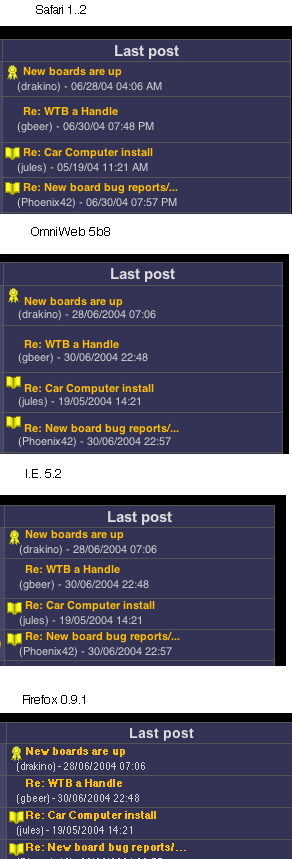
Since I am something of a browser collector here is a less artifact filled comparison for you. They all look pretty good to me except for firefox.
-Mike
Posted by: FireFox31
Re: empeg.css contest - 30/06/2004 22:46
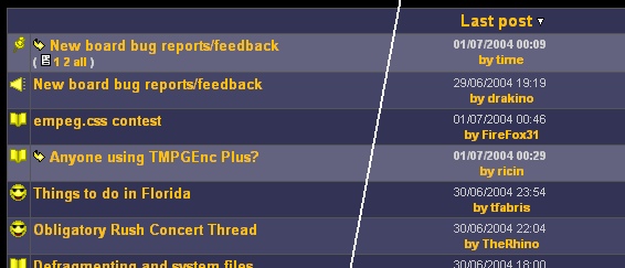
The frontpage looks great, thanks for "restoring" it. It is kind of cool to see which thread the most recent post went into. But I will second the notion to return the "newest member" bit to the top. I always loved watching our user count grow. ... Oh wait, there it is at the bottom. Cool. Any need to move it to the top? Ah, not a big deal.
Posted by: Dignan
Re: empeg.css contest - 30/06/2004 23:05
That's funny, Firefox looks nothing like that on my machine. I'm starting to like how it renders more than IE did (I know Bitt will be happy that I'm becoming an anti-aliasing fan)
Posted by: wfaulk
Re: empeg.css contest - 01/07/2004 02:24
I assume those are all MacOS X. Yeah. The Mozilla folks are obviously unconcerned about making their products look good there. Don't know why. Firefox 0.9.1 on my new laptop (and, yes, I do intend to continue mentioning it as much as possible) looks quite good, especially after I turned ClearType on.
Posted by: genixia
Re: empeg.css contest - 01/07/2004 02:39
Mozilla 1.0 on linux, minimum font size 16.
Posted by: mcomb
Re: empeg.css contest - 01/07/2004 02:46
Quote:
Mozilla 1.0 on linux, minimum font size 16.
Hmmm, a little better than on OS X, but still looks like a** compared to any other browser unfortunately. Dignan's screen shot is less than perfect as well (in my opinion). Seems like the mozilla family is still a bit behind in font handling.
-Mike
Posted by: Roger
Re: empeg.css contest - 01/07/2004 04:47
Quote:
but still looks like a** compared to any other browser unfortunately
Frankly, the fonts in Firefox 0.8 on Debian/unstable really suck. They're not even sans-serif. Why is font management so bloody hard in X/Gnome/KDE/whatever?
Posted by: drakino
Re: empeg.css contest - 01/07/2004 04:59
Quote:
Why is font management so bloody hard in X/Gnome/KDE/whatever?
I think you answered your own question.
One thing that does irritate me with Linux is the lack of standards in the most important part, the GUI. If it is going to be a modern desktop OS, it has to have a good working GUI that anyone can pick up and use, and not just the one user of that machine.
This is one reason why I don't run Linux on the desktop. It however rocks on the server when the interface I See is the same local, or over port 22.
Posted by: wfaulk
Re: empeg.css contest - 01/07/2004 12:45
X had no facility for antialiasing fonts until about two years ago. Before that, all fonts were 1-bit rendered, and that was defined by the spec. I haven't looked into what the new stuff does, but it's implemented as an extension to the X protocol, not as a replacement for the standard font rendering. As such, programs have to be specifically built to use the new font renderer.
Of course, I haven't looked at this in a while and could be wrong.