Sorry guys, I somehow goofed that poll so nobody could vote. Let's try again.
Please let me know which light difussion / style you like better: the amber hollow "triangle in triangle" (TNT?) design, or the green filled Brian/Stu design ("point of light"? POL?).

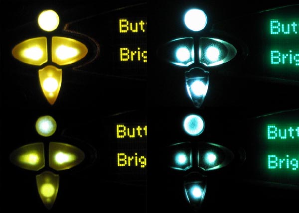
The picture shows (left) my SLA prototype hollow amber buttons at (top) brightness Max and (bottom) brightness 4; then (right) Brian's filled green buttons at (top) brightness Max and (bottom) brightness 4.
On the hollow buttons, the light fill the large hollow space, but that creates a darker wall outlining the part, thus making it a light triangle in a darker triangle. The final material (polycarbonate) may pass light better, so the wall may fill more and not appear so dark.
On the filled buttons, the plastic is nearly touching the light. Though you mainly see a single point of light, this creates a cool effect kind of lighting the walls of the button because they are at an angle to the face. However, some optics make the light seem trapped within the button when viewed at an angle (especially for the top one).
Some notes:
My camera makes these look brighter than they are.
Maybe it's not fair comparing dark green to light amber.
Big thanks to Paul for loaning me a set of Brian's green buttons.


 Previous Topic
 Index
Index
