#197660 - 13/01/2004 01:39
 Re: Opinions on new logo...
[Re: David]
Re: Opinions on new logo...
[Re: David]
|
carpal tunnel

Registered: 13/02/2002
Posts: 3212
Loc: Portland, OR
|
I agree -- the one in the top right, but with 'IT Services', instead. Bottom left is right out -- I think that gives the impression that you're doing electronics, rather than networky type stuff. My second favourite is the bottom right. I think it's a good idea, and could be improved by taking the 'IT Services' line from the one in the top right (the logo feels unbalanced the way it is now), and by reducing the complexity of the top graphic a little bit (I have a feeling that it would reduce to a smudge of grey). Don't forget, you can have different logos for different applications, so long as there is enough of a consistency between them that they are all recognizably the same company.
Oh, and like that email I just now received told me: Out of ideas? Viagra can inspire you!
|
|
Top
|
|
|
|
|
#197661 - 13/01/2004 05:25
Re: Opinions on new logo...
[Re: canuckInOR]
|
enthusiast

Registered: 22/09/2002
Posts: 249
Loc: Germany, Cologne
|
Ok, this is my favourite, too. I watched the logos and tipped on the top right. But some seconds later I thought it was too simple.
I tested all the logos and pulled them through my fax. As to be expected the simple logos are faxable, the others went to undefined scribblings.
here you can see the faxed logos.
I love the bottom right, but it's definitely unusable for faxing. Printed out from my printer it looks good. Very good.
As canuckInLA told, it's possible to use more than one logo.
In this case I propably may combine the top right and the botttom right.
Again, thank you a lot for giving me so much response!
Rolf
_________________________
Connecting Empeg via Bluetooth or Wireless LAN http://empeg.rowi.net*** Proud owner of the European Worst Install Trophy 2003 ! *** RoWi
|
|
Top
|
|
|
|
|
#197662 - 13/01/2004 16:27
Re: Opinions on new logo...
[Re: mschrag]
|
Anonymous
Unregistered
|
the FedEx logo, the negative space of the E and x makes an arrow
I just noticed it after you pointed it out and I used to work for them!
|
|
Top
|
|
|
|
|
#197663 - 12/05/2004 05:13
Re: Opinions on new logo...
[Re: ]
|
enthusiast
Registered: 22/09/2002
Posts: 249
Loc: Germany, Cologne
|
Some time ago I started this thread but since today I haven't got a logo. Didn't expect it so hard for me. As I created an icon I thought about this logo thing. Reading these postings I thought many times of "simple", "easy to read" and so on. Obviously the least thing is "design". Is it? Why is design so unimportant? So what, I thought of making a logo just by making the icon bigger...

What do you say, is it the right way?
regards,
Rolf
Edited by rowitech (12/05/2004 05:14)
_________________________
Connecting Empeg via Bluetooth or Wireless LAN http://empeg.rowi.net*** Proud owner of the European Worst Install Trophy 2003 ! *** RoWi
|
|
Top
|
|
|
|
|
#197664 - 12/05/2004 06:24
Re: Opinions on new logo...
[Re: rowitech]
|
carpal tunnel

Registered: 20/05/2001
Posts: 2616
Loc: Bruges, Belgium
|
The link to your logo is broken...
_________________________
Riocar 80gig S/N : 010101580 red
Riocar 80gig (010102106) - backup
|
|
Top
|
|
|
|
|
#197665 - 12/05/2004 07:55
Re: Opinions on new logo...
[Re: rowitech]
|
addict
Registered: 05/05/2000
Posts: 623
Loc: Cambridge
|
Reading these postings I thought many times of "simple", "easy to read" and so on. Obviously the least thing is "design". Is it? Why is design so unimportant?
The word 'design' hasn't been mentioned much because making something simple and easy to understand is design. Graphic design is about communication. There's no point designing something that people don't understand, however pretty it looks.
|
|
Top
|
|
|
|
|
#197666 - 12/05/2004 08:15
Re: Opinions on new logo...
[Re: David]
|
pooh-bah
Registered: 16/04/2002
Posts: 2011
Loc: Yorkshire UK
|
Hell, that's my career out' the window: I've spent 40 years on the premise that if people understand what I'm doing, they'll figure that they can do it for less themselves! That's the whole premise that any profession operates under: Accountants, Lawyers and....IT people.
No, second thoughts, you're right, it's just that people don't understand the value in what you say...any more in wording than design.
Maybe, I'm just having a bad day poring over a 60+ page consultation document that Whitehall have asked me to comment on the voracity of, hereineafter and therefortoo, whereinafter and whatthehell....
_________________________
Politics and Ideology: Not my bag
|
|
Top
|
|
|
|
|
#197667 - 12/05/2004 09:13
Re: Opinions on new logo...
[Re: boxer]
|
carpal tunnel

Registered: 18/01/2000
Posts: 5680
Loc: London, UK
|
document that Whitehall have asked me to comment on the voracity of
What? They're concerned that this document is going to eat everything it sees?

_________________________
-- roger
|
|
Top
|
|
|
|
|
#197668 - 12/05/2004 12:35
Re: Opinions on new logo...
[Re: Roger]
|
enthusiast
Registered: 22/09/2002
Posts: 249
Loc: Germany, Cologne
|
>The link to your logo is broken...
Is there any? The jpg is at http://www.rowi.net/icon.jpg
Rolf
_________________________
Connecting Empeg via Bluetooth or Wireless LAN http://empeg.rowi.net*** Proud owner of the European Worst Install Trophy 2003 ! *** RoWi
|
|
Top
|
|
|
|
|
#197670 - 12/05/2004 12:55
Re: Opinions on new logo...
[Re: rowitech]
|
carpal tunnel
Registered: 24/12/2001
Posts: 5528
|
What ever is at that URL isn't a JPEG. I downloaded it and it doesn't have the JPEG header. File thinks it's just data.
|
|
Top
|
|
|
|
|
#197671 - 12/05/2004 13:28
Re: Opinions on new logo...
[Re: tfabris]
|
carpal tunnel

Registered: 25/12/2000
Posts: 16706
Loc: Raleigh, NC US
|
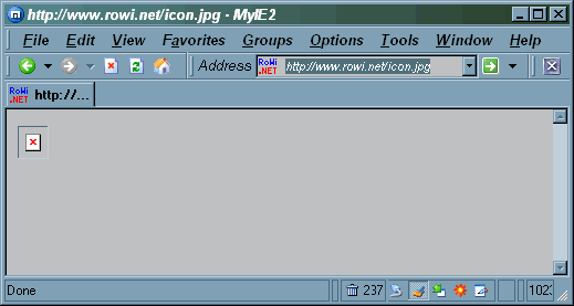
Shows up for me.
% file icon.jpg
icon.jpg: ms-windows icon resource - 1 icon
Edited by wfaulk (12/05/2004 13:29)
_________________________
Bitt Faulk
|
|
Top
|
|
|
|
|
#197672 - 12/05/2004 15:42
Re: Opinions on new logo...
[Re: wfaulk]
|
carpal tunnel
Registered: 24/12/2001
Posts: 5528
|
Hmm. magic must be out of date.
|
|
Top
|
|
|
|
|
#197673 - 12/05/2004 15:47
Re: Opinions on new logo...
[Re: tman]
|
carpal tunnel
Registered: 25/12/2000
Posts: 16706
Loc: Raleigh, NC US
|
I meant to say that the image shows up for me (Mozilla 1.5 Sparc Solaris), and to add that I also get usable results from my magic file.
_________________________
Bitt Faulk
|
|
Top
|
|
|
|
|
#197674 - 12/05/2004 16:17
Re: Opinions on new logo...
[Re: wfaulk]
|
carpal tunnel

Registered: 10/06/1999
Posts: 5914
Loc: Wivenhoe, Essex, UK
|
I displays in Firefox on Windows, but oddly if you right click on the image it says its alternate text is "The image http://www.rowi.net/icon.jpg cannot be displayed, because it contains errors."
_________________________
Remind me to change my signature to something more interesting someday
|
|
Top
|
|
|
|
|
#197675 - 12/05/2004 16:19
Re: Opinions on new logo...
[Re: andy]
|
carpal tunnel
Registered: 10/06/1999
Posts: 5914
Loc: Wivenhoe, Essex, UK
|
Ah, mystery solved...
It is actually a Windows icon file, not a jpeg. If you save the file and change the extension to .ico Windows recognises it and displays it.
Mozilla/Firefox must be ignoring the file type information and examining the file itself to work out its type.
_________________________
Remind me to change my signature to something more interesting someday
|
|
Top
|
|
|
|
|
#197676 - 12/05/2004 17:47
Re: Opinions on new logo...
[Re: rowitech]
|
old hand
Registered: 20/03/2002
Posts: 729
Loc: Palo Alto, CA
|
Some time ago I started this thread but since today I haven't got a logo.
I don't know if you'll like this one, I just kinda threw it together. But, I feel bad that you still don't have a logo.
_________________________
- trs
|
|
Top
|
|
|
|
|
#197677 - 12/05/2004 18:09
Re: Opinions on new logo...
[Re: trs24]
|
old hand
Registered: 20/03/2002
Posts: 729
Loc: Palo Alto, CA
|
Here's another with a totally different approach - since a Rowi is also a kind of Kiwi Bird... It's kind of reminiscent of the O'reilly books. Hey, what can I say. I'm bored.
Attachments
215044-rowi2.gif (186 downloads)
_________________________
- trs
|
|
Top
|
|
|
|
|
#197678 - 12/05/2004 18:14
Re: Opinions on new logo...
[Re: trs24]
|
old hand
Registered: 20/03/2002
Posts: 729
Loc: Palo Alto, CA
|
And flip-floped. I like this one more...
Attachments
215046-rowi3.gif (213 downloads)
_________________________
- trs
|
|
Top
|
|
|
|
|
#197679 - 12/05/2004 18:23
Re: Opinions on new logo...
[Re: trs24]
|
old hand
Registered: 20/03/2002
Posts: 729
Loc: Palo Alto, CA
|
And without a shadow. I couldn't get the right angles for the shadow anyway.
Attachments
215048-rowi4.gif (204 downloads)
_________________________
- trs
|
|
Top
|
|
|
|
|
#197680 - 12/05/2004 20:01
Re: Opinions on new logo...
[Re: rowitech]
|
carpal tunnel

Registered: 17/12/2000
Posts: 2665
Loc: Manteca, California
|
Why is the Earth illuminated by two Sun's?
_________________________
Glenn
|
|
Top
|
|
|
|
|
#197681 - 12/05/2004 23:46
Re: Opinions on new logo...
[Re: gbeer]
|
enthusiast
Registered: 22/09/2002
Posts: 249
Loc: Germany, Cologne
|
Easy things first:
>Why is the Earth illuminated by two Sun's?
Because I should do things I'm able to do ;-). Never let a networker do graphical things. And this is the fact why I don't have a logo yet...
>Icon or jpeg?
Well, my Firefox doesn't like to open *.ico, just renamed it to a jpeg and thought nobody would care :-). But anyway, even in the screenshot of tfabris you'll see this logo as an icon between Address and the URL... ;-)
trs24:
Isn't THAT cool? Wow! I've heard of a rowi bird as I googled around. But I didn't connect it to a logo. This has nothing to do with networking but with rowi, maybe one more reason to go into this direction.
I'd like to get the word rowi connected to the url rowi.net, so is it possible to attach the .net (however) ?
Just printed it out to see what happens with the bird. Hmm, I expected less because of the fine structure of it (my bad printer is a good surce for testing ;-)). I have to play aound with the bird ;-) to see if it's printable. Would this be free for using or do I have to buy the rowibird from a pet shop?
Thank you very much for so much attention on my posting. I never expected so much care.
regards,
Rolf
_________________________
Connecting Empeg via Bluetooth or Wireless LAN http://empeg.rowi.net*** Proud owner of the European Worst Install Trophy 2003 ! *** RoWi
|
|
Top
|
|
|
|
|
#197683 - 13/05/2004 08:36
Re: Opinions on new logo...
[Re: rowitech]
|
old hand
Registered: 20/03/2002
Posts: 729
Loc: Palo Alto, CA
|
is it possible to attach the .net (however) ? Sure! See attached. I thought the .net actually got in the way of your message. The reason I didn't attach it is because of a few reasons you might want to keep in mind:
1) A domain name and company name are not necessarily the same thing.
2) Are you Rowi or are you Rowi.net?
3) A domain name can always be placed elsewhere on print items. A logo doesn't have to do everything for you.
4) I worked for dot com's and I resent them. 
Just things to keep in mind - except for #4 of course.
Would this be free for using Sure, I made it. Consider that kiwi royalty free!
I have to play aound with the bird ;-) to see if it's printable. I didn't bother to make the Rowi at a printable dpi. So... It's not going to look that great printed unless it is shrunk down pretty far. Otherwise, it's going to be pretty fuzzy.
_________________________
- trs
|
|
Top
|
|
|
|
|
#197684 - 13/05/2004 12:33
Re: Opinions on new logo...
[Re: trs24]
|
enthusiast
Registered: 22/09/2002
Posts: 249
Loc: Germany, Cologne
|
Cool.
1) In this case it is ;-). The name is rowi.net it-services (even if it services may be better for the USA than it-services, but for german purposes it's better with the "-" )
2) rowi.net, even if the people call me rowi, my company is called rowi.net. Having the whole domain in the name should be easier to remind...
3) Sure, but isn't it nice to have everything embedded?
4) Sorry, I'm just a german, had to translate but couldn't catch this sentence right... :-(
Is the rowi bird popular? I'm quite sure I'm the only german who knows it... How did you knew about it?
I really consider letting this rowi bird be my companion. Even the german translation of "having a bird" means something like "you are crazy", but anyway, maybe this hits the point ;-).
Rolf
_________________________
Connecting Empeg via Bluetooth or Wireless LAN http://empeg.rowi.net*** Proud owner of the European Worst Install Trophy 2003 ! *** RoWi
|
|
Top
|
|
|
|
|
#197685 - 13/05/2004 13:19
Re: Opinions on new logo...
[Re: rowitech]
|
carpal tunnel
Registered: 20/05/2001
Posts: 2616
Loc: Bruges, Belgium
|
4) Sorry, I'm just a german, had to translate but couldn't catch this sentence right... :-(
4) I worked for dot com's and I resent them.
He means that he really, really, REALLY dislikes the dot coms.(and he has worked for them)
_________________________
Riocar 80gig S/N : 010101580 red
Riocar 80gig (010102106) - backup
|
|
Top
|
|
|
|
|
#197686 - 13/05/2004 15:16
Re: Opinions on new logo...
[Re: rowitech]
|
old hand
Registered: 20/03/2002
Posts: 729
Loc: Palo Alto, CA
|
3) Sure, but isn't it nice to have everything embedded? If the domain is your brand, then yes. I have worked for quite a few companies in the past, though, that could not understand that a brand and a domain name are not the same thing. In your case, however, it is.
4) Sorry, I'm just a german, had to translate but couldn't catch this sentence right... Archeon pretty much summed it up. I have worked for dotcoms in the past (as in companies with ".com" tacked to the end of the name). My last experience of working for a dotcom was being escorted out of the building with the rest of the staff by the local Sheriff. After all, all dotcomers were criminals, right? 
Is the rowi bird popular? I'm quite sure I'm the only german who knows it... How did you knew about it?
I imagine only in New Zealand. I only knew about it because of a past discussion with an ornithologist friend of mine.
Anyway, feel free to do what you like with that logo. I'm pleased that you like it. If at the very least, you can use it for a launching pad for other logo ideas.
_________________________
- trs
|
|
Top
|
|
|
|
|
#197687 - 15/05/2004 23:31
Re: Opinions on new logo...
[Re: tfabris]
|
pooh-bah

Registered: 15/01/2002
Posts: 1866
Loc: Austin
|
tfabris, how is MyIE2 working out for you?
|
|
Top
|
|
|
|
|
#197688 - 16/05/2004 00:28
Re: Opinions on new logo...
[Re: RobotCaleb]
|
carpal tunnel

Registered: 20/12/1999
Posts: 31565
Loc: Seattle, WA
|
Quite well, actually. Better than firefox was. I still have some minor quibbles with it, but not as many quibbles as I do with IE or Firefox. Still undecided if it will remain my primary browser, but it's doing well so far.
|
|
Top
|
|
|
|
|
#197689 - 16/05/2004 12:14
Re: Opinions on new logo...
[Re: tfabris]
|
enthusiast
Registered: 22/09/2002
Posts: 249
Loc: Germany, Cologne
|
>After all, all dotcomers were criminals, right?
Yes :-). Nobody get's money today by doing real work, isn't it? ;-)
I'm so happy having rowi.net instead of rowi.com, so I'm out of focus ;-). Nobody told me that dotcom stands for any domain else than .com :-).
The logo is so impressive to me that I will use it, so thank you again! One problem could be if I put in onto a big big banner. Resizing it to very big sizes may kill the bird. Do you see an option for this? Can you tell me how one could create this rowi bird in a big size? Surely it isn't possible to put the bird in a vector format, because it is too fine structured. The letters may be a standard font, so this should be no problem.
Yes, I know, I'm asking much and maybe I pull your nerves but I don't want other logos for the rest of my life. This is it...

Rolf
_________________________
Connecting Empeg via Bluetooth or Wireless LAN http://empeg.rowi.net*** Proud owner of the European Worst Install Trophy 2003 ! *** RoWi
|
|
Top
|
|
|
|
|
|


 Previous Topic
 Index
Index