#197630 - 09/01/2004 14:30
 Opinions on new logo...
|
enthusiast

Registered: 22/09/2002
Posts: 249
Loc: Germany, Cologne
|
Hi,
I got no one to make a new logo for my small company, so I did it myself... Would you please give me your opinion on this logo and if it tells something to you, what?
Rolf

_________________________
Connecting Empeg via Bluetooth or Wireless LAN http://empeg.rowi.net*** Proud owner of the European Worst Install Trophy 2003 ! *** RoWi
|
|
Top
|
|
|
|
|
#197631 - 09/01/2004 14:37
Re: Opinions on new logo...
[Re: rowitech]
|
pooh-bah

Registered: 09/09/2000
Posts: 2303
Loc: Richmond, VA
|
I'm not a designer, but I worked for years with them ... Of course this is all just personal preference, so take it with a grain of salt:
My first impression is that ultradetailed globe is going to turn into mush when you shrink it down to put it on a business card -- always best to keep it simple, second is I think http://www.scifi.com/ , third I think using a typewriter font for high tech services maybe isn't the best connotation ... Something like a Futura is always popular with the kids these days 
|
|
Top
|
|
|
|
|
#197632 - 09/01/2004 17:29
Re: Opinions on new logo...
[Re: mschrag]
|
carpal tunnel

Registered: 23/08/2000
Posts: 3826
Loc: SLC, UT, USA
|
Ah, the good ol' swoosh logos. No offense, but if i see another logo with a swoosh in it i'm going to go postal! 
and i agree about the simplicity and the font. Use something more bold or unique.
|
|
Top
|
|
|
|
|
#197633 - 10/01/2004 07:01
Re: Opinions on new logo...
[Re: loren]
|
enthusiast
Registered: 22/09/2002
Posts: 249
Loc: Germany, Cologne
|
Thank you very much for your answers and links.
Especially one sentence from TheStreet.com is one point I had in mind creating the logo:
the reason so many Net companies fall back on the swoosh is that it is so hard to represent the Internet graphically. "There's nothing to grab onto. There's nothing there. It's space," she says
In fact it's hard for an Internet company to describe the Internet in a logo. Beside of this, I wanted to represent wireless communications (WLAN + Bluetooth), in general radio transmission or data connections via radio waves.
At third, but not least, I want to represent programming, especially PHP, but that's too deep, I think.
I was shocked to see so many swooshes on so many logos. I realized that I'm not the first one to have this idea... The much detailed globe is in fact a problem, especially printed out or faxed.
The courier font I used is a font which exists for a long time, so my company does (10 years). I've searched for an easy to read font and something not too space-invaders like. It should be reputable, not so colourful. I mostly wear black or grey suits, even they aren't colourful.
It's hard to find something that suits my needs, I think.
Rolf
_________________________
Connecting Empeg via Bluetooth or Wireless LAN http://empeg.rowi.net*** Proud owner of the European Worst Install Trophy 2003 ! *** RoWi
|
|
Top
|
|
|
|
|
#197634 - 10/01/2004 08:06
Re: Opinions on new logo...
[Re: loren]
|
carpal tunnel
Registered: 24/12/2001
Posts: 5528
|
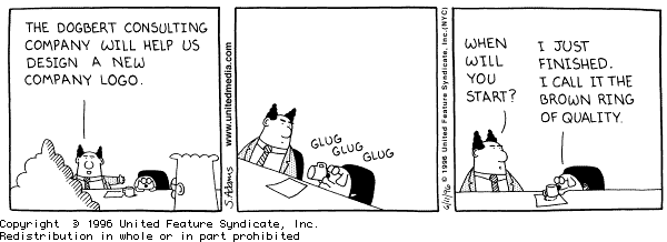
At least the swoosh looks nicer than Lucent's "'brown ring of quality" logo. Can anybody tell me who said that?
[edit]Umm. Corrected quote...[/edit]
Edited by tman (10/01/2004 08:36)
|
|
Top
|
|
|
|
|
#197635 - 10/01/2004 08:22
Re: Opinions on new logo...
[Re: tman]
|
carpal tunnel
Registered: 15/08/2000
Posts: 4859
Loc: New Jersey, USA
|
It was based on a Dilbert cartoon...
_________________________
Paul Grzelak
200GB with 48MB RAM, Illuminated Buttons and Digital Outputs
|
|
Top
|
|
|
|
|
#197636 - 10/01/2004 08:24
Re: Opinions on new logo...
[Re: pgrzelak]
|
carpal tunnel
Registered: 24/12/2001
Posts: 5528
|
Yup. I always think about to that strip when I see the lucent logo. A few other places have similar logos actually. Dreamcast was one of them. A blue swirly thing. Nice and simple though I guess.
|
|
Top
|
|
|
|
|
#197637 - 10/01/2004 08:33
Re: Opinions on new logo...
[Re: tman]
|
carpal tunnel
Registered: 15/08/2000
Posts: 4859
Loc: New Jersey, USA
|
For those who may not have seen it...
The Lucent logo...

The Dilbert cartoon...

_________________________
Paul Grzelak
200GB with 48MB RAM, Illuminated Buttons and Digital Outputs
|
|
Top
|
|
|
|
|
#197638 - 10/01/2004 09:59
Re: Opinions on new logo...
[Re: mschrag]
|
addict
Registered: 05/05/2000
Posts: 623
Loc: Cambridge
|
I agree that the globe is far too detailed and will reproduce poorly at small sizes and even more poorly at small sizes on the web. Simplify it down to just a globe, leving the grid lines on it so that it is clear it is a globe and not a solid circle.
Courier is not a good typeface to use for a logo. Every time you send something to print, you'll get a call from the repro guys who think you've forgotten to include a font with your job.
I'd recommend a sans-serif face like Frutiger, Univers and so on. Avoid any of the standard Windows set, anything too stylised (nothing too thick, thin, compressed or expanded). Go for something with clean lines and don't be afraid to use alignment rather than space the 'IT services' tagline across the full width.
Again, these are personal opinions, but I am speaking as a (former) professional typesetter and jobbing designer and I'm really just repeating the basic rules I learned in that trade.
|
|
Top
|
|
|
|
|
#197639 - 10/01/2004 12:03
Re: Opinions on new logo...
[Re: pgrzelak]
|
old hand

Registered: 01/10/2002
Posts: 1033
Loc: Fullerton, Calif.
|
Don't forget, Lucent called their logo "The red ring of innovation".
|
|
Top
|
|
|
|
|
#197640 - 10/01/2004 14:42
Re: Opinions on new logo...
[Re: loren]
|
veteran

Registered: 19/06/2000
Posts: 1495
Loc: US: CA
|
The globe is widely overused as well. I don't have to list links for that one, they're all over the place.
Oh, and this might be good to read over. There are a lot of logos to look at for ideas and information here too.
_________________________
Donato MkII/080000565 MkIIa/010101253 ricin.us
|
|
Top
|
|
|
|
|
#197641 - 11/01/2004 12:08
Re: Opinions on new logo...
[Re: ricin]
|
enthusiast
Registered: 22/09/2002
Posts: 249
Loc: Germany, Cologne
|
Wow, I didn't notice that it's not the empeg forum here but the forum of logo-designers :-). Honest, I see many very creative postings and very interesting links. Thanks a lot for this.
I've learned a lot.
- A logo should be simple
- Give it a unique look
- Don't use old fonts (like my courier in the example, but why does Microsoft in ".net"?)
- Bring in your imagination of your company. If it's a computer/internet company, be a bit spacey..
Now I think it's even harder to build my new logo. I'm totally confused. So much information means so much to deal with, so much to take care of. Why is it so hard?
Rolf
_________________________
Connecting Empeg via Bluetooth or Wireless LAN http://empeg.rowi.net*** Proud owner of the European Worst Install Trophy 2003 ! *** RoWi
|
|
Top
|
|
|
|
|
#197642 - 11/01/2004 13:45
Re: Opinions on new logo...
[Re: rowitech]
|
pooh-bah
Registered: 09/09/2000
Posts: 2303
Loc: Richmond, VA
|
In reply to:
like my courier in the example, but why does Microsoft in ".net"?
http://www.microsoft.com/net/images/banner.gif
.net isn't Courier ... it /appears/ to be a modified Arial. The "." is not arial, it actually looks like the Courier New period in bold; but then, that's just a black circle, so it could be anything , and the bottom of the t is elongated (and obviously the n and e are connected). But other than that I think it is based on Arial.
As far as realizing it's hard to do a logo, you're definitely right ... I was always most impressed with good logos and good icons moreso than most other types of graphic design, because it is really hard to fit so much meaning in a simple symbol. I always like the subtle things -- like in the FedEx logo, the negative space of the E and x makes an arrow -- Just kind of cool. Graphic design is such a different mindset than programming. It was really cool working with those guys because I look at things in a completely different way now.
ms
Edited by mschrag (11/01/2004 13:49)
|
|
Top
|
|
|
|
|
#197643 - 11/01/2004 14:17
Re: Opinions on new logo...
[Re: rowitech]
|
pooh-bah
Registered: 14/01/2002
Posts: 2489
|
Just do what I did at www.clonetech.co.uk
Its far easier!
|
|
Top
|
|
|
|
|
#197644 - 11/01/2004 15:37
Re: Opinions on new logo...
[Re: mschrag]
|
old hand
Registered: 14/04/2002
Posts: 1172
Loc: Hants, UK
|
like in the FedEx logo, the negative space of the E and x makes an arrow
Jesus... I've never noticed that, and I even watched "Cast Away" a couple of weeks ago!
Actually... seeing things in white space is apparently one of the signs of schizophrenia.
Gareth
|
|
Top
|
|
|
|
|
#197645 - 11/01/2004 16:12
Re: Opinions on new logo...
[Re: g_attrill]
|
pooh-bah

Registered: 20/01/2002
Posts: 2085
Loc: New Orleans, LA
|
I never noticed either. In fact, I had to go check it out to be sure.
|
|
Top
|
|
|
|
|
#197646 - 11/01/2004 16:33
Re: Opinions on new logo...
[Re: g_attrill]
|
pooh-bah
Registered: 09/09/2000
Posts: 2303
Loc: Richmond, VA
|
Yeah I never saw this .. My designer friend pointed it out -- he worked at the company that did their logo. And actually, if anyone was insane, it was this guy, so that makes some sense
ms
|
|
Top
|
|
|
|
|
#197647 - 11/01/2004 16:55
Re: Opinions on new logo...
[Re: pgrzelak]
|
addict

Registered: 24/07/2003
Posts: 500
Loc: Colorado, N.A.
|
The logo and subsequent cartoon were, in fact, the highlights of my Lucent-branded career! Toward the end there, we came to call it the "inflamed [censored] of leadership," but that's when we all thought former CEO Rich McGinn was going to be doing hard time in prison as Guido's bitch. Never happened
_________________________
-- DLF
|
|
Top
|
|
|
|
|
#197648 - 11/01/2004 20:19
Re: Opinions on new logo...
[Re: DLF]
|
journeyman

Registered: 21/09/1999
Posts: 71
Loc: Denmark
|
x3 on the FedEx thing
The Lucent logo looks like something the Goatse guy made by sitting on a piece of tissue paper...
_________________________
#00182, 10GB, Amber, Denmark, Peugeot 206, Rebuilding my stereo - great things to come
|
|
Top
|
|
|
|
|
#197649 - 12/01/2004 01:51
Re: Opinions on new logo...
[Re: rowitech]
|
carpal tunnel

Registered: 08/03/2000
Posts: 12318
Loc: Sterling, VA
|
I think my favorite simple logo is the one for H&R Block. It's a freakin' block! How much simpler can you get than a green square?
One thing that might be an idea, if you do any computer graphics, is to try some self-limiting. Maybe try drawing something with an icon creation program. I only say this because creating your own icons is quite challenging for similar reasons. You want something that doesn't look like other icons, something personal. But you also have to worry about that icon being shrunk in the Quicklaunch bar, or the top-left corner of the window that opens, and it has to be just as recognizable when smaller (like yours on a business card).
I don't know, just a thought. I stink at making icons
_________________________
Matt
|
|
Top
|
|
|
|
|
#197650 - 12/01/2004 02:57
Re: Opinions on new logo...
[Re: Yonzie]
|
carpal tunnel
Registered: 24/12/2001
Posts: 5528
|
Aw man. Did you have to bring up the goatse guy?!?
|
|
Top
|
|
|
|
|
#197651 - 12/01/2004 08:54
Re: Opinions on new logo...
[Re: mschrag]
|
enthusiast
Registered: 22/09/2002
Posts: 249
Loc: Germany, Cologne
|
Yes, it's hard, but I will reach my goal, sooner or later :-).
I sit in front of the FedEx-Logo. Hmm, what does it tell me?

Ok, english is not my motherlanguage, but e.g. for FatEx I would know clearly what they want to do :-). But FedEx doesn't talk to me. Because of the different color I see two words instead of one, but where is the arrow or do I sit in front of the wrong logo? Nevertheless, the FedEx logo is simple and clearly readable, that is an important fact.
And to the .net: Yes, I'm convinced that they didn't use just courier.
Rolf
_________________________
Connecting Empeg via Bluetooth or Wireless LAN http://empeg.rowi.net*** Proud owner of the European Worst Install Trophy 2003 ! *** RoWi
|
|
Top
|
|
|
|
|
#197652 - 12/01/2004 09:02
Re: Opinions on new logo...
[Re: rowitech]
|
pooh-bah
Registered: 09/09/2000
Posts: 2303
Loc: Richmond, VA
|
Where the E and the x connect (in the Ex of FedEx), the white space creates an arrow pointing to the right ...
|
|
Top
|
|
|
|
|
#197653 - 12/01/2004 09:54
Re: Opinions on new logo...
[Re: rowitech]
|
carpal tunnel

Registered: 25/12/2000
Posts: 16706
Loc: Raleigh, NC US
|
FedEx is short for Federal Express. Sometime a few years ago, they shortened their name to what everyone called them anyway. Of course, now they have a service called FedEx Express, which makes very little sense.
_________________________
Bitt Faulk
|
|
Top
|
|
|
|
|
#197654 - 12/01/2004 11:57
Re: Opinions on new logo...
[Re: wfaulk]
|
carpal tunnel

Registered: 20/12/1999
Posts: 31565
Loc: Seattle, WA
|
Sometime a few years ago, they shortened their name to what everyone called them anyway. Heh, sort of like "KFC".
I remember when that one happened, Dennis Miller was the SNL news guy. His take on it was "Come on, guys. It's chicken parts for God's sake. It's not that cool."
|
|
Top
|
|
|
|
|
#197655 - 12/01/2004 14:21
Re: Opinions on new logo...
[Re: mschrag]
|
enthusiast
Registered: 22/09/2002
Posts: 249
Loc: Germany, Cologne
|
Oh, now I can see the arrow between the E and the x, but I think you have to know it to see it :-).
Rolf
_________________________
Connecting Empeg via Bluetooth or Wireless LAN http://empeg.rowi.net*** Proud owner of the European Worst Install Trophy 2003 ! *** RoWi
|
|
Top
|
|
|
|
|
#197656 - 12/01/2004 14:25
Re: Opinions on new logo...
[Re: mschrag]
|
addict
Registered: 20/11/2001
Posts: 455
Loc: Texas
|
the white space creates an arrow pointing to the right
Hmmph.... I wonder how much that arrow cost? I never noticed that before.
|
|
Top
|
|
|
|
|
#197658 - 12/01/2004 16:00
Re: Opinions on new logo...
[Re: mschrag]
|
enthusiast
Registered: 22/09/2002
Posts: 249
Loc: Germany, Cologne
|
New day, new start. I'm going to pay a logomaker for helping me to create a logo. He warmed up knowing my preferences and gave me this:

I told him I'd like a circuit board (bottom left) or connections from one point to another (bottom right) to describe what I do. Ok, it's only a try for describing, but it's a start.
All the 6 logos show the name in clear typed letters. This is important for me. People should know where they have to go in case of contact.
But I don't know if I did it right with lower- and uppercase with "IT-Services". Is this ok? Or is "IT services" the correct one? Or should i do the whole thing in uppercase to prevent any problem with this?
Heaven, I wish I get my logo before going bankrupt :-).
Any comments if this is the right way with these logos?
Rolf
_________________________
Connecting Empeg via Bluetooth or Wireless LAN http://empeg.rowi.net*** Proud owner of the European Worst Install Trophy 2003 ! *** RoWi
|
|
Top
|
|
|
|
|
#197659 - 12/01/2004 18:10
Re: Opinions on new logo...
[Re: rowitech]
|
addict
Registered: 05/05/2000
Posts: 623
Loc: Cambridge
|
Go for 'IT Services'. The hyphen looks awkward and is unnecessary. Go for caps only if it suits the design.
My favourite is the top-right design, but IT SERVICES needs to be in a heavier face and with a little more spacing around it and the grey panel.
The drop-shadow on that logo looks good for a web page and on a white background reduces the sharp contrast between the blue type and the white background, making the image look less jaggy.
When it come to print, only keep that drop shadow if you're doing full colour printing at a high line screen (175lpi, ideally 200lpi) if you're doing cheaply-printed leaflets, newspaper ads, or laser print, get rid of it as it will just make it look blurry.
|
|
Top
|
|
|
|
|
|

 Previous Topic
 Index
Index