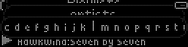
Itve just reorganised my playlists so that artists are divided by initial letter (rather than in groups of three initial letters - abc, def, ghi, etc). Now, I don't get a shaded background behind each menu item; it's just enlarged. This can make it less obvious which letter is selected - see attached image. I'd prefer it if some padding were added to the selected item if necessary in order for it to be highlighted.
Attachments
63372-menu.png (213 downloads)
_________________________
Toby Speight
030103016 (80GB Mk2a, blue)
030102806 (0GB Mk2a, blue)


 Previous Topic
 Index
Index
