#157098 - 24/04/2003 18:27
 OmniWeb 4.5 Sneakypeeks
|
carpal tunnel

Registered: 25/12/2000
Posts: 16706
Loc: Raleigh, NC US
|
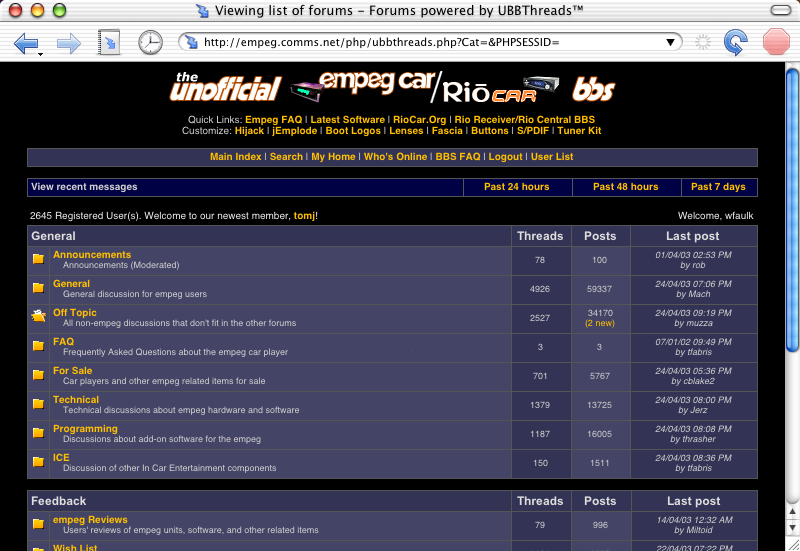
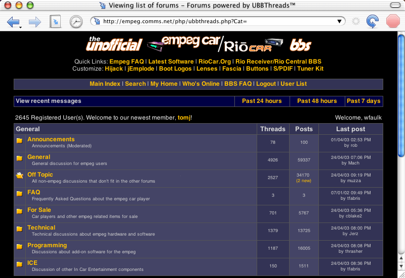
Anyone running the OmniWeb 4.5 sneakypeeks? I just found them today (I thought that the ``Check for Updates'' would continue to tell me about them, but it didn't) and I'm somewhat disappointed.
They've gone from using their own rendering engine to using the built-in MacOS X one, which means that it looks virtually identical to Safari, which, while better than the majority of other MacOS X and Windows browsers, looks ten times worse than OmniWeb 4.2 and earlier did, IMO.
It is nice to have the faster rendering and the OmniWeb features at the same time, but I really wish they'd have spent time speeding up their own engine.
To demonstrate, here are two screenshots you should all be familiar with, one from OmniWeb 4.2 and one from OmniWeb 4.5sp13:


Am I just nuts? I just liked the old rendering better.
_________________________
Bitt Faulk
|
|
Top
|
|
|
|
|
#157099 - 24/04/2003 18:29
Re: OmniWeb 4.5 Sneakypeeks
[Re: wfaulk]
|
carpal tunnel
Registered: 25/12/2000
Posts: 16706
Loc: Raleigh, NC US
|
Attachments
155158-ow45.png (135 downloads)
_________________________
Bitt Faulk
|
|
Top
|
|
|
|
|
#157100 - 24/04/2003 20:24
Re: OmniWeb 4.5 Sneakypeeks
[Re: wfaulk]
|
carpal tunnel

Registered: 08/03/2000
Posts: 12318
Loc: Sterling, VA
|
I'm not sure what to say here. I don't think I can give a good opinion because those probably aren't the best representation of either. If you mean how they size everything and what-not, that's also a tough question.
I guess the first one made everything a big big, but aside from the links, I see no difference between the two.
Oh, and it's not like those shots make your browser look better than IE or other browsers  Link us some non-resized shots for a better comparison
_________________________
Matt
|
|
Top
|
|
|
|
|
#157101 - 24/04/2003 20:43
Re: OmniWeb 4.5 Sneakypeeks
[Re: Dignan]
|
carpal tunnel
Registered: 25/12/2000
Posts: 16706
Loc: Raleigh, NC US
|
I see no difference between the two The antialiasing is quite different between them, the kerning is significantly different, and one seems to have forgotten to use italics (which I'll forgive as a bug). The graphic displays the same, though. non-resized Huh? it's not like those shots make your browser look better than IE or other browsers I respectfully call your opinion ... wrong. 
_________________________
Bitt Faulk
|
|
Top
|
|
|
|
|
#157102 - 24/04/2003 21:07
Re: OmniWeb 4.5 Sneakypeeks
[Re: wfaulk]
|
carpal tunnel
Registered: 08/03/2000
Posts: 12318
Loc: Sterling, VA
|
non-resized
Huh? So those images are the original size, and nothing's been done to them? In that case, I definitely disagree that those look good at all. On my computer all that text is blurry and pretty ugly. One pic only looks better because the text is smaller and the effects are less noticeable.
*edit*
I didn't notice the italics, though. that's strange
Edited by DiGNAN17 (24/04/2003 21:08)
_________________________
Matt
|
|
Top
|
|
|
|
|
#157103 - 24/04/2003 21:17
Re: OmniWeb 4.5 Sneakypeeks
[Re: wfaulk]
|
addict
Registered: 05/05/2000
Posts: 623
Loc: Cambridge
|
Any difference in kerning could be because the type is smaller. Low-res rendering of type <10pt will often look poor and appear as if it hasn't been kerned at all.
|
|
Top
|
|
|
|
|
#157104 - 24/04/2003 21:32
Re: OmniWeb 4.5 Sneakypeeks
[Re: Dignan]
|
addict
Registered: 05/05/2000
Posts: 623
Loc: Cambridge
|
> I definitely disagree that those look good at all. On my computer all
> that text is blurry and pretty ugly.
Maybe the difference in gamma settings makes thosse screen grabs look poor on Windows, but to me, that type is well anti-aliased and very clear. Maybe the sharp contrast between the screengrab and the plain text on your screen makes it look blurred in comparison.
ClearType on XP does a similar thing but not as well. I think MS turned it off by default because people initially think it is blurred. Once you get used to it though, reading text on screen is easier and using a computer without it looks ugly and outdated.
|
|
Top
|
|
|
|
|
#157105 - 24/04/2003 21:37
Re: OmniWeb 4.5 Sneakypeeks
[Re: David]
|
carpal tunnel
Registered: 08/03/2000
Posts: 12318
Loc: Sterling, VA
|
That's possible, but the larger type such as "View Recent Messages" is more blurry than mine.
_________________________
Matt
|
|
Top
|
|
|
|
|
#157106 - 25/04/2003 07:07
Re: OmniWeb 4.5 Sneakypeeks
[Re: Dignan]
|
carpal tunnel
Registered: 25/12/2000
Posts: 16706
Loc: Raleigh, NC US
|
all that text is blurry and pretty ugly Okay. Then I'll discount your opinion since you dislike antialiased text.
_________________________
Bitt Faulk
|
|
Top
|
|
|
|
|
#157107 - 25/04/2003 07:10
Re: OmniWeb 4.5 Sneakypeeks
[Re: David]
|
carpal tunnel
Registered: 25/12/2000
Posts: 16706
Loc: Raleigh, NC US
|
Any difference in kerning could be because the type is smaller. Low-res rendering of type <10pt will often look poor and appear as if it hasn't been kerned at all. I would agree except for the fact that, at least to me, the OW4.2 text is smaller and better kerned (perfectly to my eye) than OW4.5's or Safari's (which are nearly identical if not totally).
_________________________
Bitt Faulk
|
|
Top
|
|
|
|
|
#157108 - 25/04/2003 11:15
Re: OmniWeb 4.5 Sneakypeeks
[Re: wfaulk]
|
carpal tunnel

Registered: 20/12/1999
Posts: 31578
Loc: Seattle, WA
|
I don't get it. It just looks like two screen shots are the same but with only the font size changed between them. In Internet Explorer, you can change the font size on-the-fly with the "view" menu.
Am I supposed to be choosing whether I like a certain size of font?
|
|
Top
|
|
|
|
|
#157109 - 25/04/2003 11:22
Re: OmniWeb 4.5 Sneakypeeks
[Re: tfabris]
|
carpal tunnel
Registered: 25/12/2000
Posts: 16706
Loc: Raleigh, NC US
|
You, also, do not have a discerning eye.
_________________________
Bitt Faulk
|
|
Top
|
|
|
|
|
#157110 - 25/04/2003 11:28
Re: OmniWeb 4.5 Sneakypeeks
[Re: wfaulk]
|
carpal tunnel
Registered: 20/12/1999
Posts: 31578
Loc: Seattle, WA
|
You, also, do not have a discerning eye. It's not that, it's just that if you want me to compare font rendering engines, give me apples to compare to apples. At those screen resolutions, the difference between two font sizes can be extreme because of the changes in the hinting that happens.
|
|
Top
|
|
|
|
|
#157111 - 25/04/2003 11:39
Re: OmniWeb 4.5 Sneakypeeks
[Re: tfabris]
|
carpal tunnel
Registered: 25/12/2000
Posts: 16706
Loc: Raleigh, NC US
|
That was as close as I could get. That's another complaint that I have with the new rendering engine, that the relative font sizes of things went way off. The white text -- the description of the forums -- is ``normal'' sized for my screen. I think that the lower one does a much better job of sizing the larger text. It's noticeably larger, but it's more subliminal, not ``hey! that's larger'' like the other one is.
But my main problem is with the kerning, which I think should be well obvious in each set of fonts. I do understand that it's hard to tell, given that the fonts are different sizes, but all I can tell you is that the kerning doesn't really seem affected by size. Maybe I should go back and make screenshots with intentionally large fonts.
For examples, though, to point it out, take a look (in the description text, to compare like font sizes) at the juxtaposition of ``mp'' in ``empeg''. On one, it runs the two letters together (you can see a bright spot). In the other, they are distinct. Then look at the ``sa'' in ``for sale'' in the description of the ``For Sale'' forum. In one, they're set much too far apart.
Edited by wfaulk (25/04/2003 11:45)
_________________________
Bitt Faulk
|
|
Top
|
|
|
|
|
#157112 - 25/04/2003 12:26
Re: OmniWeb 4.5 Sneakypeeks
[Re: wfaulk]
|
carpal tunnel
Registered: 20/12/1999
Posts: 31578
Loc: Seattle, WA
|
The M and P running together in the small text would indicate to me that it's ignoring some or all of the hinting features built into the font.
|
|
Top
|
|
|
|
|
#157113 - 25/04/2003 14:48
Re: OmniWeb 4.5 Sneakypeeks
[Re: wfaulk]
|
carpal tunnel
Registered: 13/07/2000
Posts: 4174
Loc: Cambridge, England
|
But my main problem is with the kerning, which I think should be well obvious in each set of fonts. It's interesting that the post counts -- made of digits, which you would not expect to have kern pairs -- seem to be pixel-for-pixel identical in the two images.
Peter
|
|
Top
|
|
|
|
|
#157114 - 25/04/2003 19:10
Re: OmniWeb 4.5 Sneakypeeks
[Re: peter]
|
carpal tunnel
Registered: 25/12/2000
Posts: 16706
Loc: Raleigh, NC US
|
Well, this may be exactly what you're saying, but if the digits have no hinting information and one of the browsers honors it and the other doesn't, then the numbers would look the same. So maybe that it what the issue is. You'd think that was something that Apple would have dealt with in their library.
I sent an email to the OmniWeb mailing list and got a reasonably positive response.
One thing I didn't realize, too, is that even though I was using sneakypeek 13, sneakypeek 1 came out well less than a month ago. That's much faster than their old development turnaround time. So maybe they've just not gotten to it yet.
_________________________
Bitt Faulk
|
|
Top
|
|
|
|
|
#157115 - 26/04/2003 03:24
Re: OmniWeb 4.5 Sneakypeeks
[Re: wfaulk]
|
carpal tunnel
Registered: 13/07/2000
Posts: 4174
Loc: Cambridge, England
|
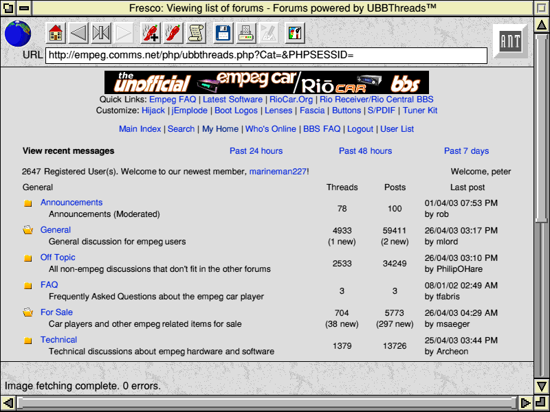
I sent an email to the OmniWeb mailing list "Far better [text rendering] than any other web browser on any platform"? That's fighting talk where I come from. But I'll just have to assume you've not seen ANT Fresco on RiscOS...
Peter
|
|
Top
|
|
|
|
|
#157117 - 26/04/2003 08:01
Re: OmniWeb 4.5 Sneakypeeks
[Re: wfaulk]
|
carpal tunnel
Registered: 13/07/2000
Posts: 4174
Loc: Cambridge, England
|
While searching for a Fresco on RISCOS screenshot, I found this page, whose screenshot leads me to believe that you might have a personal stake in this. LOL -- and in fact the program in your screenshot was written by Hugo. But yes, I did bust a gut to make the typography good in Fresco, especially with the OS's standard fonts, which were carefully kerned and hinted. (To a certain extent, though I was standing on the shoulders of giants, particularly those of the bloke who wrote the RiscOS font rendering engine, who is about six foot seven.)
I never got round to some of the typography-geek features I hoped to implement, though, such as automatic use of "fi" and "fl" ligatures (which were in the standard code page!) and of expert sets.
Unfortunately, Fresco (at least the rather old version I've got) makes a pretty poor fist of the Empeg BBS, as it doesn't support stylesheets.
Peter
|
|
Top
|
|
|
|
|
#157118 - 26/04/2003 18:34
Re: OmniWeb 4.5 Sneakypeeks
[Re: peter]
|
carpal tunnel
Registered: 25/12/2000
Posts: 16706
Loc: Raleigh, NC US
|
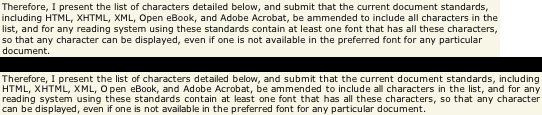
automatic use of "fi" and "fl" ligatures Drool.... One would assume the other ligatures, too. expert sets You're over my head, here, I'm afraid.
Searching for what you're talking about, though, I found another good text rendering example:

_________________________
Bitt Faulk
|
|
Top
|
|
|
|
|
#157120 - 27/04/2003 03:28
Re: OmniWeb 4.5 Sneakypeeks
[Re: wfaulk]
|
carpal tunnel
Registered: 13/07/2000
Posts: 4174
Loc: Cambridge, England
|
Drool.... One would assume the other ligatures, too. The standard fonts only came with "fi" and "fl". Going beyond that would have only made sense for users who'd gone out and found fonts that had expert sets available.
An expert set, BTW, is just a supplementary font with the missing typography-geek glyphs from a standard one: "ffl"-ligature, fraction-composing glyphs, small caps, and so on. Major foundries sell them, but usually only on book fonts. All the extra glyphs you need have Unicode code points nowadays, except for small caps and superscript letters, which are viewed by Unicode as being the same glyphs as normal letters but in a different font.
Peter
|
|
Top
|
|
|
|
|
#157121 - 27/04/2003 05:48
Re: OmniWeb 4.5 Sneakypeeks
[Re: tfabris]
|
carpal tunnel
Registered: 25/12/2000
Posts: 16706
Loc: Raleigh, NC US
|
Yeah. That egregious example is why I chose that particular snippet, but the rest of it is awful, too.
_________________________
Bitt Faulk
|
|
Top
|
|
|
|
|
#157122 - 27/04/2003 06:22
Re: OmniWeb 4.5 Sneakypeeks
[Re: wfaulk]
|
carpal tunnel
Registered: 25/12/2000
Posts: 16706
Loc: Raleigh, NC US
|
Oh, and for reference, and to prove that I was wrong about Safari and OW4.5 sharing the exact same renderer (even though there are certain similarities):

_________________________
Bitt Faulk
|
|
Top
|
|
|
|
|
#157123 - 27/04/2003 16:35
Re: OmniWeb 4.5 Sneakypeeks
[Re: peter]
|
enthusiast

Registered: 07/01/2002
Posts: 337
Loc: Squamish, BC
|
I find more and more scary the amount of stuff the empeg team have been involved in that I unknowingly used at one time.
|
|
Top
|
|
|
|
|
#157124 - 27/04/2003 16:54
Re: OmniWeb 4.5 Sneakypeeks
[Re: snoopstah]
|
carpal tunnel
Registered: 20/12/1999
Posts: 31578
Loc: Seattle, WA
|
Yes, it's true. They are the Dark Cabal That Controls Everything.
|
|
Top
|
|
|
|
|
#157125 - 30/04/2003 21:10
Re: OmniWeb 4.5 Sneakypeeks
[Re: wfaulk]
|
carpal tunnel
Registered: 25/12/2000
Posts: 16706
Loc: Raleigh, NC US
|
Sneakypeek 16 ``now do[es] subpixel character positioning again (just as we did in OmniWeb 4.2).'' Sah-weet:

_________________________
Bitt Faulk
|
|
Top
|
|
|
|
|
#157126 - 30/04/2003 23:35
Re: OmniWeb 4.5 Sneakypeeks
[Re: wfaulk]
|
pooh-bah

Registered: 31/08/1999
Posts: 1649
Loc: San Carlos, CA
|
neakypeek 16 ``now do[es] subpixel character positioning again
Cool, I am looking forward to switching back to it as my main browser. Safari's speed and stability was enough to make be switch, but OmniWeb just feels better. It's one of those rare pieces of software where it seems like they did everything just the way you would have. Plus, I think it is the only shareware I have ever purchased so it is nice to get some use out of it.
-Mike
|
|
Top
|
|
|
|
|
|

 Previous Topic
 Index
Index