Number of colors: 4 either optimized median cut or standard/web-safe will look fine
This is the step where I do it differently, and I'll explain why:
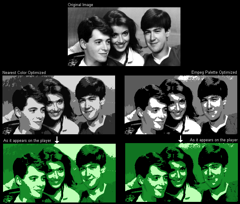
Color reducing to a median or standard palette assume equidistant shades. Even color reducing to the Windows palette makes the same assumption. And on your computer screen, these will be fine.
However, on the car player, the shades of color are not equidistant. The two shades of gray are very close to each other in brightness, and they are very far from black in actual perceived brightness on the screen.
Sure, if you paste your optimized-median-cut image into LogoEdit or RAWerter, it will work. But when PaintShop Pro color-reduced it, it was choosing its reduction cutoff points based on different grayscale values than the player displays. So the image on the player is not optimized as well as it could have been if you'd used a custom palette. Here is an example of what I mean:

I admit, the difference between the two images is subtle. Whether or not you prefer one image over the other isn't the point. My point is that doing a straight evenly-spaced color reduction doesn't choose the values at the optimum points for the player's screen.
I'm still working on getting the "perfect" values for the palette, but for now, you can find the values I'm using for the logo editor's palette in its .INI file. You can use these values in a custom PaintShop Pro palette if you like.

 Previous Topic
 Index
Index
