Awww F*ck it. I just looked at the screen caps at the Hijack site and I think hi-light is just dandy.
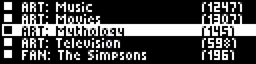
Well... The only caveat is that the Empeg's 5-pixel font uses two different shades and anti-aliasing in order to achieve readable text in such a small font... With 32 lines vertical, and one line spacing in between each line of text, you've got 2 lines left over. I just did a screengrab of my Trivia game's category menu which uses the 5 pixel font (or my hacked version of it which might not be quite as pretty as the current one):

So with 2 lines to spare, the current playlist item could be in a 7-pixel high font (not shown.) So while high intensity wouldn't distinguish it much from the other lines (which have to use a combination of high and medium intensity pixels for the anti-aliasing, I think inverse would. The size of the text alone would help, but the only way to know for sure would be to see it. (Now and Next is a reasonable approximation, I guess.)


 Previous Topic
 Index
Index
